
Two behaviors dominate how prices move. In mean reversion a move tends to be given back, so what rises soon falls. In momentum a move tends to continue, so what rises keeps rising. Most desks treat these as two states the market switches between and build a regime detector to answer one question, which regime are we in now. The answer lands in a column called regime, one label per asset per day, and everything downstream reads it, including the strategy switch, the position sizer and the attribution report.
That single label is the mistake, and not because the detector is weak. The same asset, on the same day, mean-reverts and trends at once at different horizons. Apple can pull back day to day while drifting steadily upward over months, both true at the same moment. The horizon, not the calendar date, decides which behavior you see, and a one-label-per-day schema has nowhere to put it. I will show this on real data rather than argue it.
The data is Bloomberg daily prices for US equities, adjusted for splits and dividends. I keep only names that begin at the 2007 open and still trade in July 2026, the span of Apple, giving a clean rectangle of 129 stocks with 4,919 daily returns each. Every number below comes from this panel and the code that ships with the article, and where a claim rests on a published paper, I say so.
The variance ratio test across horizons
The tool for this is the variance ratio, formalized as a test of the random walk hypothesis by Lo and MacKinlay in 1988, and the idea is simple. If prices followed a random walk, the variance of returns over q days would be exactly q times the variance over a single day. Take the actual ratio of the two and you get one number. At 1 the series has no memory, which is the random walk case. Below 1 moves are given back, the fingerprint of reversion, and above 1 they compound, the fingerprint of trend. Written out,
where the terms in the sum are the return’s autocorrelations. What matters is what the formula does not force. Nothing pins the ratio to one side of 1, and nothing keeps it on the same side as q grows. A little reversion day to day and a little trend building over a quarter will put the ratio below 1 at short horizons and above 1 at long ones in the very same series. The whole curve, ratio against horizon, is the object worth reading. Collapse it to a label and you have picked one horizon and thrown the others away.
Here is that curve for Apple, with three other names from the panel alongside it. The shaded band is Apple’s margin of error, the range where the true value plausibly sits.

[Exhibit 1: Variance ratio profile, AAPL vs three peers]
Apple reverts gently from two to ten days, flattens near three weeks, rises to a mild trend around the two to three month mark, then rolls back toward reversion at a year. Short-horizon reversion and medium-horizon trend coexist in one stock over one window, with nothing switching. Digital Realty, on the same axes, reverts at every horizon and keeps falling to about 0.40 at a year, while CenterPoint and Accenture take their own paths in between. That is four stocks in one market over one span of time producing four different shapes. A detector forced to emit one regime here is wrong about most of them. Which regime is the market in was never answerable, because the answer depends on both the stock and the horizon, and a single label holds neither.
The band also shows something plainly, which is that not one of Apple’s horizons is statistically significant. Nineteen years of one of the most heavily traded stocks on earth, and the structure is visible to the eye yet thin under a standard-error test. That sample-size problem returns below.
What one regime label throws away
Four names make the point and the full panel proves it. I computed the variance ratio at nine horizons for all 129 stocks and looked at how they spread out at each horizon.

[Exhibit 2: Cross-sectional spread of VR(q) across 129 names]
The typical stock reverts at every horizon, more so as the horizon lengthens, but the spread is the story. At two days the middle 80% of names sit in a tight band from 0.88 to 1.02, and by one year that band has fanned open from 0.41 to 1.08. Pin each stock to the horizon where it first flips from reversion to trend and the crossing lands anywhere from 15 to 67 days for the middle half, median near 37, while two names in three never cross at all. There is no shared horizon at which this market turns over, so a single label has to average across a spread this wide, which leaves it close to meaningless.
The Hurst exponent and its small-sample bias
People reach for a shortcut here, the Hurst exponent, a single number H meant to say whether a series trends when H is above 0.5, reverts when it is below, or follows a random walk at 0.5. It is really the variance ratio in other clothing. If variance grows like q raised to 2H, then
so read as a curve H carries exactly the information already shown. The damage comes from collapsing it to one number, which blends every horizon under weights you never chose and discards the structure you wanted to keep.
The usual way of computing it is also biased. Rescaled range, the classic recipe, carries a large small-sample bias. To expose it I ran the estimator on each stock, then again on a shuffled copy of that stock’s own returns. Shuffling destroys all memory, so the shuffled series is random by construction and an honest estimator must return 0.5 on it.
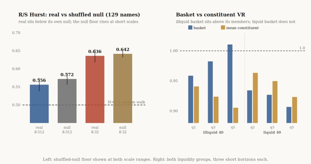
[Exhibit 3: R/S Hurst real vs shuffled null, and basket vs constituent VR]
It does not. Across the 129 names the real series averages H of 0.556, which a naive pipeline reports as mild trending. The estimator’s own bias floor, measured by shuffling each name’s returns and rerunning, sits at 0.572. The real average is not above that floor but slightly below it, and a paired test across names puts the gap at 0.016 with a t of 7.3, so 0.556 is significantly under what this estimator produces on pure noise rather than evidence of persistence at all. The bias worsens as the fit is restricted to short scales, where the shuffled floor itself climbs to 0.642 and the real short-scale average tracks just below it at 0.636. The whole apparent signal is the estimator, and the correct benchmark is never 0.5 but the shuffled floor for the exact scale grid used. Corrections have existed since Anis and Lloyd in Biometrika in 1976, and Lo rebuilt the statistic in Econometrica in 1991 to stop short-range noise from posing as long memory, yet neither fix sits in most of the Hurst code in circulation. A Hurst number handed over without its scale grid and a matching shuffle baseline is uninterpretable, since comparing it against 0.5 compares it against a value the estimator never produces on noise.
The right panel makes a second, quieter point, and shows both baskets so the contrast is visible rather than asserted. An equal-weighted basket of the forty least liquid names has a variance ratio above the average of its own members, by 0.02 at two days and 0.11 at five. The same basket built from the forty most liquid names sits below its members instead, with no upward gap at any horizon. That wedge in the illiquid case is not a signal but stale prices. Thin names last trade at scattered moments before the close, so the basket picks up a positive autocorrelation its members lack, which is the non-synchronous-trading effect of Scholes and Williams in 1977 and of Lo and MacKinlay in 1990. The single-name short end carries the opposite artifact. A wide bid-ask spread alone drives the ratio below 1, because each round trip crosses the spread twice, a reversion no one can capture, which is Roll’s 1984 result. The data itself manufactures part of the short end of every curve here, downward for single names and upward for illiquid baskets.
Sample size and significance at long horizons
Come back to significance, because it bounds how much of this you may believe. Twenty years of daily data sounds enormous, and by row count it is. A one-year variance ratio is really a statement about non-overlapping one-year blocks, though, and nineteen years holds nineteen of them. Rolling the window makes roughly 4,800 overlapping estimates that look like 4,800 observations to whatever reads them, while the independent information is nineteen.
This is why Apple’s yearly reading never reached significance, and no vendor can fix it, because power at the annual horizon is set by calendar time and you cannot buy more of that. Pooling across names helps less than the count suggests, since the liquid names that carry most capital move together. Across the twenty most liquid stocks, each trading over a hundred million dollars a day, the average pairwise correlation is 0.40, holding whether you take the top ten, twenty, or fifty. At that correlation twenty names behave like barely two independent observations. The response is not to stop measuring the long horizon but to carry its uncertainty everywhere, which means storing the effective sample size and correcting the standard errors for overlap with the Newey-West adjustment before trusting any t-statistic.
One caveat sharpens this rather than softening it. Requiring every name to survive the full window makes the panel survivor-biased, which trims the worst multi-year losses and drags long-horizon ratios downward. That bias reaches further than any single claim, since it pulls down the whole right-hand end of the cross-sectional fan, so the low medians at 252 days are partly survivorship rather than pure market behavior, and multi-year reversion in particular is a finding I will not assert here. The short and intermediate horizons that carry the argument are far less exposed, since the filter selects on nineteen-year survival but barely touches two-day or quarterly behavior. The honest split is to lean on the horizons the bias cannot reach and flag the ones it can.
Bid-ask bounce, stale prices and adjustment vintage
All of this assumes the return series is genuinely a return series, and a few ordinary defects manufacture horizon structure out of nothing, landing in the statistics above. The bid-ask bounce is one, already seen, and its mark on the two-day ratio shrinks when you recompute on the mid-quote rather than the last trade, a difference that is itself a check.
Adjustment vintage is the quiet one. A back-adjusted price series is rewritten every time a dividend or split posts, so the ten-year history you pull today is not numerically the one you pulled last quarter, and a variance ratio on it is not reproducible unless you pin the vintage. In the Apple file the two big splits, seven-for-one in 2014 and four-for-one in 2020, divide the raw price cleanly while the adjusted series runs smooth through both, which is how you confirm the adjustment rather than trust it. Store raw prices with the factor table, keyed to announcement date, and it survives an audit. Clock alignment deserves the same care, since mixing a 16:00 equity close with a 16:15 futures settlement fabricates lead-lag structure that reads as horizon-dependent memory.
A horizon-indexed schema for regime output
The fix is small. Replace one regime label per asset per date with one row per asset per date per horizon, carrying the ratio, its error bar, the effective sample size, the price basis, and the adjustment vintage. A daily reversion book then reads the short-horizon rows and a quarterly trend book reads the sixty-three-day row, and neither argues with the other about the regime, because each reads a measurement matched to its own holding period.
The word regime survives, meaning something different. It stops naming a state the market is in and starts naming a property of a curve, such as where it crosses over, how steady that crossing is through time, and whether the short and long ends move together when volatility rises. Those you can estimate, bound with an error bar, and watch for drift. A label offers none of that, because you can never tell whether it moved because the market moved or because a threshold sat too close to the line. What the rest of the system needs is a small function of horizon with its uncertainty attached, and getting there is mostly ordinary data discipline. Know what your prices are, know when they were stamped, know how many independent observations you really have, and never let one number stand in for a shape.
Frequently asked questions
What is a variance ratio test?
The variance ratio compares the variance of q-day returns to q times the variance of one-day returns. Under a random walk the two are equal and the ratio is 1. A ratio below 1 indicates mean reversion and a ratio above 1 indicates momentum. Lo and MacKinlay formalized it as a specification test of the random walk hypothesis in 1988.
Why does a single regime label fail?
A regime label assigns one behavior to an asset on a given date, but the same asset reverts at short horizons and trends at longer ones at the same moment. Across 129 US equities the horizon at which a stock first flips from reversion to trend ranges from 15 to 67 days for the middle half of names, and two in three never flip at all. A single label has to average across that spread, which leaves it carrying almost no information.
What does the Hurst exponent measure, and what should it be compared against?
The Hurst exponent summarizes how the variance of returns scales with horizon, and it is algebraically equivalent to a variance ratio read at a single point. It should not be compared against 0.5. The rescaled range estimator carries a large small-sample bias, so the correct benchmark is the value the same estimator returns on shuffled copies of the same returns over the same scale grid, which in this panel is 0.572 rather than 0.5.
Why do long-horizon variance ratios rarely reach statistical significance?
A one-year variance ratio is a statement about non-overlapping one-year blocks, so nineteen years of data holds nineteen independent observations regardless of how many rows the file contains. Rolling the window produces overlapping estimates that inflate the apparent count without adding information. Pooling across names helps less than expected, because liquid names are correlated at around 0.40 and twenty of them behave like barely two independent observations.
The views, analysis and figures are the author’s own and do not necessarily reflect those of algoseek. This content is for educational purposes only and is not investment advice.


